“Times New Roman is not a font choice so much as the absence of a font choice, like the blackness of deep space is not a colour.” –Matthew Butterick, “A brief history of Times New Roman” I have long viewed Times New Roman as a cultural phenomenon rather than a set of specific shapes. This is one reason why my first redesigns were aimed at a purely conceptual result that would play with the viewer’s attention, deconstruct standard forms and disturb the routine process of reading, reawakening the eye’s interest in what it actually sees. But that was all binned. The purpose of the redesign was to improve – to evolve, not experiment or reminisce…
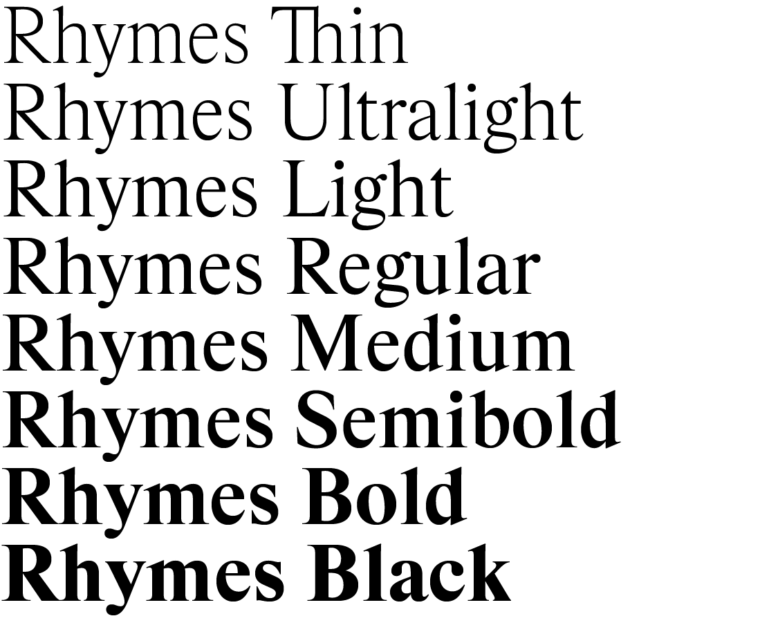
The next approach was to look for ways to really improve the original typeface, to take hold of its formal essence and reshape it into a new, more perfect result. But in the end something of a free continuation of the TNM cult was created – Rhymes. This typeface is based on a combination of the proportions of the original undigitised Times New Roman (Monotype, 48p, Series 327) template and the style of another undigitised derivation of TNM, Times Book. Regular style was drawn first, and Thin and Bold weights were later created based on it. Intermediate stages were then interpolated: Ultralight, Light, Regular, Medium, Semibold and finally the extrapolated style Black. The result is a broad range of eight weights, which especially in the light styles reveal the unrecognised form and potential of the original Times.
The name, Rhymes, also refers to the original typeface. Rather than a redesign, it is a continuation and follow-up – a rhyme. Less utilitarian and robust, more fragile and poetic. Thanks to its good readability in small type, frugal proportions and attractive details, it can be used in a wide range of applications – from posters and logotypes to poetry and longer tests. Where there once was Times, you can now use Rhymes!

