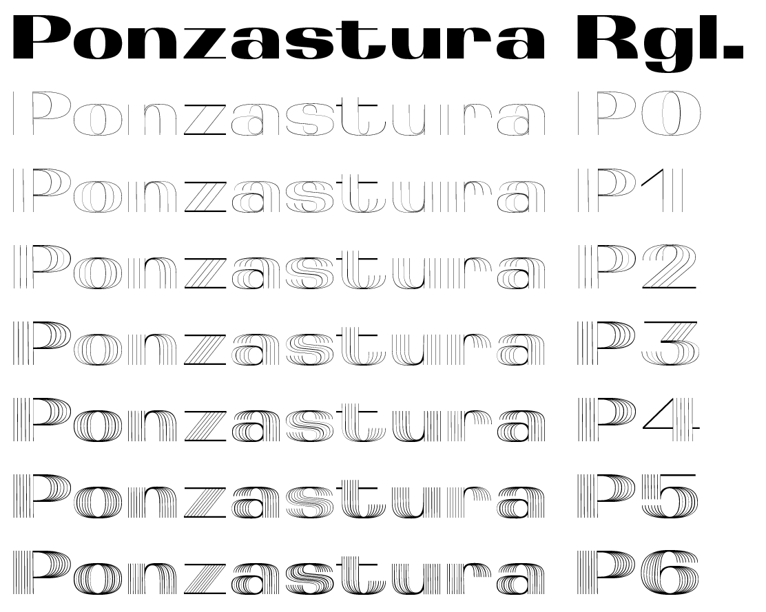
From the very beginning, reshaping Eurostile was a challenge. Its technical, bare-bones appearance was one thing I responded to. Initially I created variations that would just be composed of the retained rounded edges on the right and left sides of the original Eurostile letters (characteristic of the font), but the result was too similar to Novarese’s earlier typeface Etruria (or Recta Condensed).
What interested me was a process in which a simple principle changes the character of the entire typeface. I decided to “flip” the empty, white counters (such as in the lower-case “c”, “b” and “o”) 90°. As a result, the monolinear strokes took on contrast and stress; the letter height and width remained, as did the characteristic elements of Eurostile (the bar in “k” or the returning tail on the “t”). Subsequent hatching in six styles was just a logical underscoring of the visual perception of the typeface, which also responds quite informally to the form of the waves broadcast from televisions produced at the time. The shape of Eurostile is often compared to them. Styles with the technical names “P0” through “P6” are recommended for use in large sizes and in mutual combinations.
The classical appearance of Ponzastura, whose name is inspired by the Italian city Pontestura, where Novarese was born, is more of a reaction and interplay with the original typeface than a “repaired and contemporary version”. Nevertheless, the typeface is fully functional with different language versions, symbols, figures and more.

