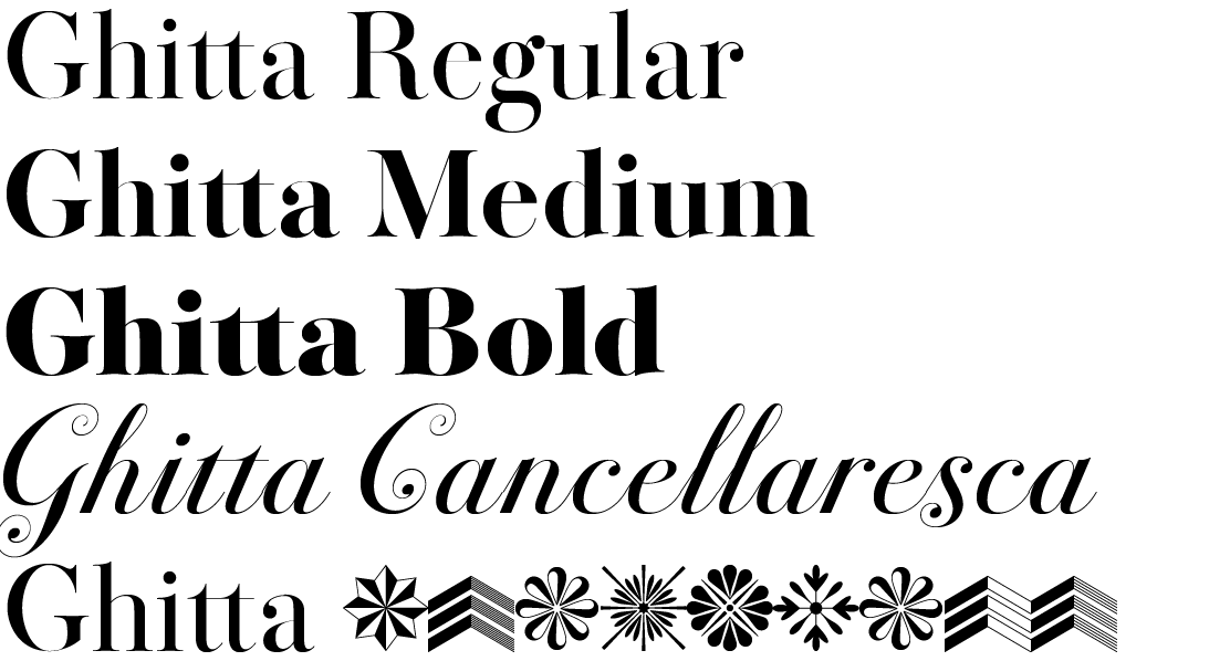
The model for the creation of my interpretation was a reprint of Bodoni’s posthumous Manuale tipografico from 1818, published by his widow, Margherit Dall’Agli. The book showcases his typeface in a broad range of sizes. The differ due to the different prints, of course, but also due to changes in how they were drawn, which are most visible at the largest scale in the book of 72 points. Here the overall character took on even a greater and (for Bodoni’s digitisation) unique elegance, and this is precisely why it became the model for my interpretation.
The basic character and structure of the typeface have been maintained, including the higher x-height and narrower proportions. The contrast between the stem and stroke are further emphasised by narrowing the strokes and shortening the character stress in rounded strokes. Likewise, the rounded connections to serifs and inner bend are stressed. Individual letters are unified by their widths and by the sizes of the ball terminals and connectors. The Semibold and Bold styles maintain the same structural principles.
Besides Bodoni’s routinely well-known typeface, Bodoni’s manual also features Cancellaresca. As it can be suitably combined with other styles, I have added it to the family. To date the specimen has not come close to containing the entire alphabet, and some existing characters were radically changed to achieve a uniform character. Order has now been brought to the decorative elements, a uniform slant to the upper-case and lower-case letters, and the weights correspond with the regular style.
The entire family has a monumental and elegant character. Stately and neutral upright styles have a whole range of applications, from monograms on flacons of perfume to headlines in a cultural magazine. Combined with the ornamental style, the festive, decorative Cancellaresca can pose on wedding announcements or invite people to attend fashion shows or have an overpriced piece of cake.

