Original: Glaser / Designer: Milton Glaser (1967)
Redesign: Galvan / Designer: Tereza Šmídová (2016)
redterezka@seznam.cz
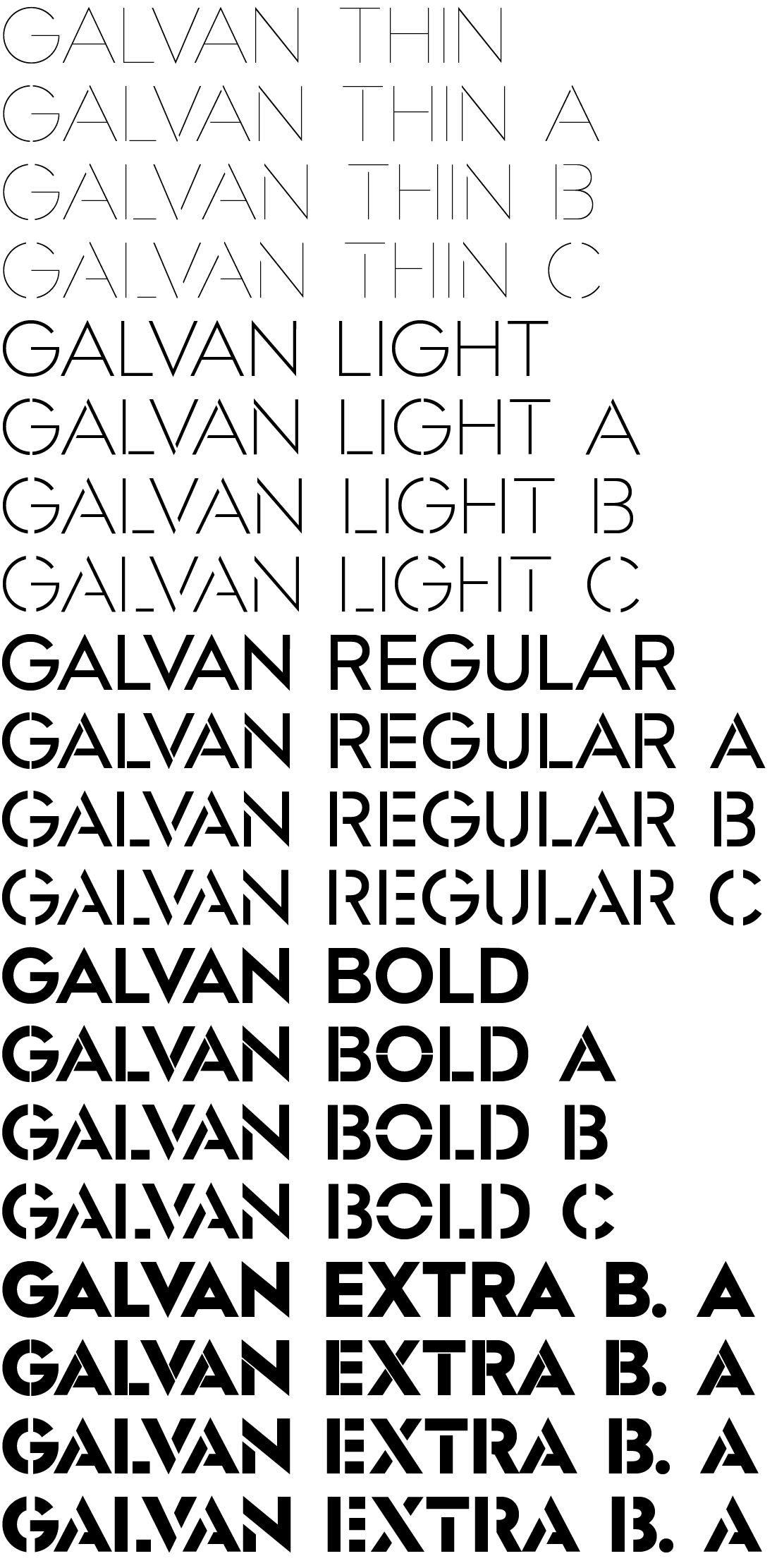
No digitisation of Glaser to date has ever contained a complete character set for all Latin script languages and often the stencil principle was omitted from some letters, so I tried to add all these missing aspects. At the same time I wanted support the characteristic alternating directions of the breaks by creating an alternate character for each letter of the alphabet, an approach that would pleasantly enliven the set text. The second decision was to also include styles with no breaks in the font family, and the third was to use two widths for the dividing strip: a hairline gap and the widest possible gap, applied to all weights.
The typeface is drawn so that individual styles with various gap widths and varying weights could be interposed between each other. The result is a large family with diversity in the details.
For the most part, the proportions of the original typeface and principle for breaks in the letters in the basic character set have been maintained. The new rounded diacritics create a pleasant contrast with the sharp terminals on the letterforms. Currency symbols and arrows have also been added to the original Glaser.
The typeface is prepared for digital use (in headlines, posters or as part of a corporate visual style) and supports manual graphic work (such as working with stencils). Due to the various widths and sizes of the breaks, the typeface can be combined and overlapped in various ways.

