Perpetua is a sensitively-drafted typeface with a number of small details that shape a sense of fragility. My aim was to create a “little brother” for the typeface and imbue it with new energy. By selecting decorative elements in particular details and slightly unifying them, I increase the hardness of the character set while trying to maintain its typical drawn detail. I draw inspiration from the original designs for small sizes while raising the x-height. By evening out the ascender height and cap height and diverging from the original shapes of the lower-case letter more distinctly, I also give the typeface a younger expression. These changes soften the overall impression of the typeface while providing space for subtler details and proportions (which are equally characteristic for the typeface) to emerge. I adhere to a sculptor’s rigidity while adding an air of calligraphy in the character stress – typical for Gill.
Oblique Felicity is even less usual in how it is drawn. When he created the lower-case letters, Gill did not approximate handwriting, as is typical in other Italics, but in many cases used the same character structure and serifs as in the upright style. Felicity has a strict, bold character. But at the same time, with its unconventional treatment, it does not fulfil the function of an Italic as well. It is more similar to an upright style and more difficult to quickly find in the text. The strongest input into the Italics is the narrowing of the characters and more conspicuous differentiation from the basic style.
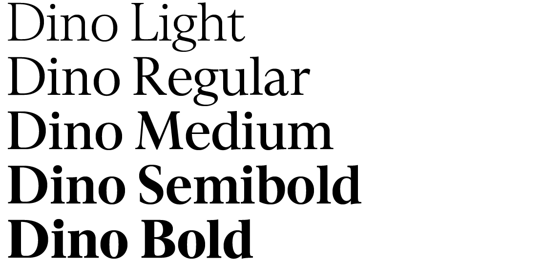
Both typeface versions are celebratory in character. In use they deserve generous treatment if the space and the use of contrasts among sizes and styles. I named the typeface after Perpetua’s real little brother, Dinocrat, who was seven years old when Perpetua was martyred. Welcome, little Dino.

