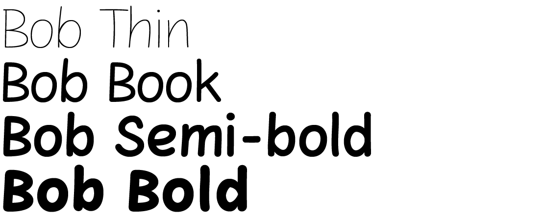
The initial inspiration in my work came from hand-written fonts, including my own handwriting. In the end, however, I concluded that how Comic Sans was created is the font’s most striking feature. My intention was to maintain the basic character of the font; other things could change. So I started to write out all the characters with a computer and mouse. The strokes are not a strict copy of the model, however. That wasn’t even what I had wanted. Drawing freehand, I tried to create their most contemporary form. The crooked and scattered letters had to be corrected and harmonised in a simpler, cleaner form – but only to a certain extent. Tracing and adding diacritical marks and other symbols was essential to create a complete set.
The font has four weights. The fragile, fine Thin took on a new character. On the other hand, in Bold the characters feature typical heavy-handedness and softness. To finish the typeface I now needed to draw alternatives for all the letters. They would differ only slightly, but even this subtle change is expressed positively in the text, with a natural randomness that breaks up the mechanical rhythm.
I believe that my typeface fulfils everything that users of Comic Sans expect. Moreover, it offers a modern form, more styles and better design. The font still is not suitable for setting longer texts, but I do recommend using it for typesetting applications associated with children, games, entertainment, sweets, fast food, cafés, comics and informal things. It comes across as relaxed, fun and original.

