There are two different designs of Chicago. Originally I was convinced that there was nothing to change on the older bitmap version, and so I chose to work on the younger, vector variant with the aim of imparting it with a more contemporary character. Work started, but soon I got too far from the original model – such as by removing the narrow terminals, which I know understand was very important. As a result, I had to go back to studying the original bitmap Chicago, but I could not ignore the current vector version. Everything had to be compared, especially at small sizes.
Now you can see a typeface that still honours the horizontal to vertical stroke width ratio. Optically it keeps the inner white space the same size and changes its treatment of round shapes. These forms, which seem round at the smallest sizes of the bitmap version, are now strictly rounded. The typeface now includes two light and one dark style. Alternative characters are now offered for several upper and lower-case letters. A fundamental change can be found in the diacritics, which are darker and more compactly connected to the character.
Even though I made stark changes to the typeface in terms of rounding the shapes, which are not typical for bitmap fonts, I was able to keep its digital flavour. The typeface has a very specific character that in itself attracts attention. As such it is ideal in places where something needs to be emphasised, but it is also a good choice for setting short texts. And it’s fun to work with :)
Original: Chicago / Designer: Susan Kare (1984)
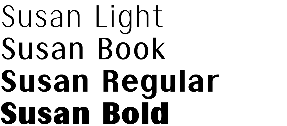
Redesign: Susan / Designer: Martin Činčár (2016)
martin.cincar@seznam.cz
