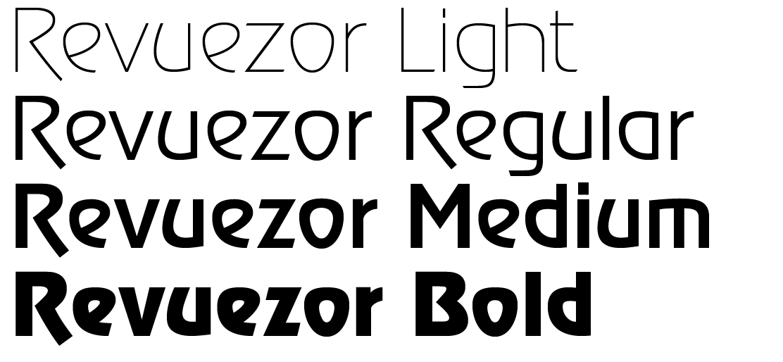
The first basic task for me lay in the fact that I needed to develop a positive relationship with Revue, at least positive enough for me to be interested in working on it and trying to develop it. The current, almost diabolically wild use of the typeface in industry and commerce that one encounters on a daily basis – whether on Hollandia brand yoghurt or all sorts of shop signs and industrial vehicles – evoked a sense of “cheapness” in me. Only after I redrew the skeleton of the typeface did I see the Art Nouveau pedigree and inspiration from letters on late 19th/early 20th century posters. In the next phase of my work, I tried to give direction to the typeface. I left out the crooked terminals of the stems and strokes “F”, “H”, “Y” and fractures in the joints of some of the upper-case letters (“A”, “B”, “D”, “P”, “R”; these principles were only used for alternative characters), and I slightly “softened” the “hard” instrokes on several characters. The final result was a typeface with a new name, Revuezor, in four styles: Bold, Medium, Regular and Light.
Revue was created for use in displays, and this did not change even after my adjustments. But now I can only hope that Revuezor will be used more prudently and moderately than was often the case for its parent.
I chose the name Revuezor not only due to the work I put into the job, which was a revision of sorts (in the sense of exploring, reassessing, adjusting, a new version of something, reconsidering and subsequently changing something). The other stimulus in choosing the name was the fact that the words “revue” and “revision” created an association with the Czech word revizor – the Czech name of Nikolai Gogol’s famous play The Government Inspector. The initial realization that I would have to work on Revue reminded me of Act I of the play: “I have invited you here, gentlemen, in order to communicate to you a most unpleasant piece of news: a government inspector is coming to visit us.” – “What, an inspector?” – “What, an inspector?” ... “Well, I declare!”– “As if we didn’t have troubles enough already!”