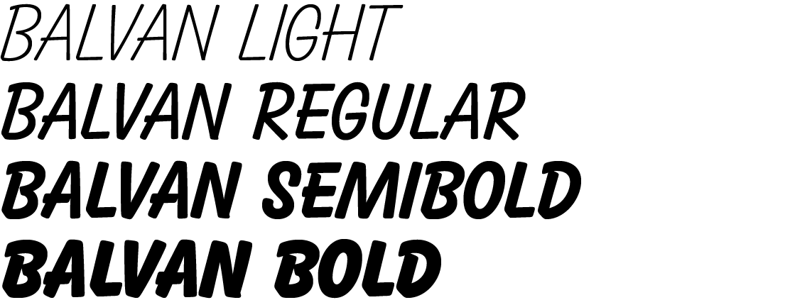
My original intention was to create lower-cases (which do not exist) to go with the existing capital letters. While making what were at first minor adjustments to bring the upper-case letters into harmony, however, I discovered the changes would have to be more pronounced.
The typeface is now drawn in four styles. The greatest shift appeared in the lightest version, which required radical adjustments. Not only did I significantly expand all the letterforms, I also adjusted the proportions of the individual characters to the entire typeface (“M”, “N”, “U”, “V”, “W”, “X”, “Z” ...). Removing the overshoot and stroke connection details, which are typical for the Bold (where I kept most of the details), helped achieve a more natural character. Both versions had the most changes in the “C”, “G”, “K”, “O”, “Q” and “S”, figures and diacritics. Several characters that are essential in the basic set needed a major shift. The ampersand, brackets, basic mathematical symbols and other characters had not been created in a unified style, but rather replaced with letters from a completely different geometric sans typeface.
The typeface is great for typesetting comics or creating subtitles for films (not just cartoons). Used sensibly, it looks very nice on covers or in magazine headlines, and its character can liven up a poster design.

Original: Balloon / Designer: Max R. Kaufmann (1939)
Redesign: Balvan / Designer: Tereza Šmídová (2016)
redterezka@seznam.cz
